UX DesignAltus Assessments
In 2020, Altus Assessments identified the need to revamp and rejuvenate its rating application. Although the existing application was functional, it had become outdated and faced numerous usability issues. These challenges, stemming from the app's aging design and functionality, prompted Altus Assessments to initiate a comprehensive overhaul to enhance the user experience and modernize the application.
Overview
Client
Altus Assessments
Project date
Oct. 2020 - April. 2021
Total duration: 6 months
The team
Product Manager
Engineering team
Product Designer
My role
UX analysis (flows and persona)
Design (app and branding)
Lo-fi prototyping
Hi-fi prototyping
Developer hand-off
Identifying the Need for Change
It became clear that the existing application had been an afterthought for Altus Assessments. Conversations with internal stakeholders revealed that raters, who represent the company's biggest cost, had been overlooked as a critical user group. This oversight highlighted the urgent need to prioritize and improve the app to better serve and support the raters.
Analysis of the Current User Journey
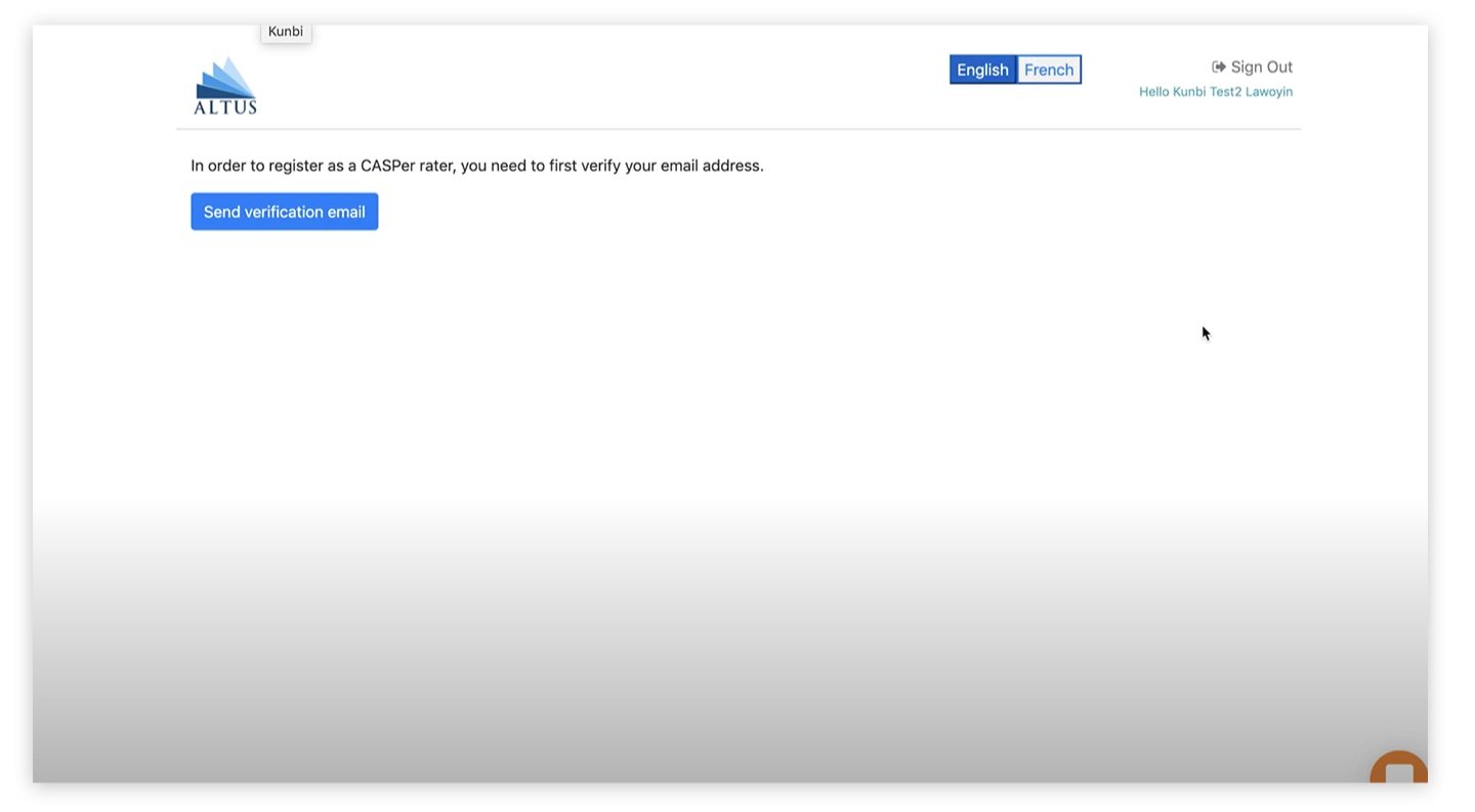
The current user journey faced several significant challenges:
⚠️ High Friction Rate:
The registration process involves numerous steps and takes a considerable amount of time, leading to a high number of user drop-offs.
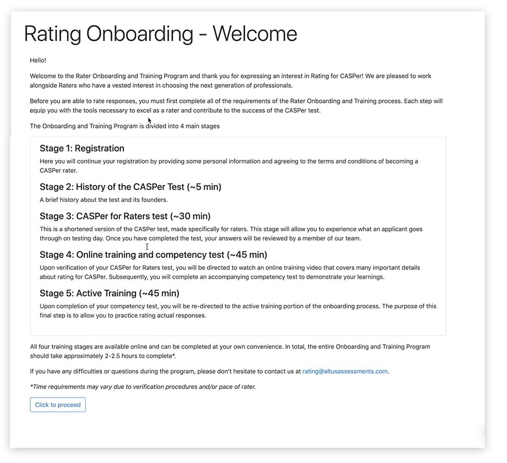
🥣 Content Overload:
The screens are heavy with content, making it difficult for users to digest the information, especially given the way it is currently presented.
👵🏼 Outdated and Inconsistent Design:
The design is outdated and lacks consistency, which detracts from the user experience.
✍🏼 Inadequate Security:
The sign-in process lacks proper security measures, which is concerning given the sensitive information Altus handles.
🗣️Lack of User Feedback:
There is insufficient feedback to inform users of their progress within the process, leaving them uncertain about their current stage.
Problem Space Exploration
To thoroughly understand and address the issues, our team employed several research methods while still in the problem space:
🧐 Competitive & Comparative Analysis:
I conducted an in-depth analysis of exemplary registration processes, examining platforms such as Google, Amazon, Facebook, Twitter, and FreshBooks. This helped us identify best practices and key features that enhance user experience.
🎤 User Interviews:
We conducted interviews with 10 participants to gain insights into their experiences, pain points, and expectations.
Competitive & comparative analysis
During our analysis, we examined several exemplary registration flows. These flows shared common characteristics that enhanced the user experience:
🎓 Ease of Use:
These platforms prioritize making the registration process as simple as possible, often handling most of the work for the user.
🧭 Minimal Navigation:
They feature limited to no navigation elements during registration to keep the user focused.
🚝 Speed:
The registration processes are designed to be fast, minimizing the time required to complete the steps.
These insights guided our approach to improving the registration flow for our application.
The users
👩🏾🦳 Raters are 65% female and 35%, male.
🇺🇸 32% American.
🇨🇦 29% Australian and Canadian.
🇪🇺 10% are in Eastern Europe.
🪟 Windows - 40%.
🍎 Macintosh - 25%
Notable quotes
“Everything just looks so dated, I wasn’t sure I was on the right site at first.”
— Participant 1
“The steps to register took forever, had I not needed the paycheck, I question if I would have finished.”
— Participant 2
Solution Space Exploration
Following user interviews and a thorough comparative and competitive analysis, our team identified key features necessary to create a valuable Minimum Viable Product (MVP):
🧗🏽♂️ Reduce Drop-off Rates and Improve Ease of Entry:
Streamline the registration process to minimize user drop-offs and enhance ease of use.
😊 Update Design for Confidence and Credibility:
Revamp the design to instill confidence and credibility in the product.
⚖️ Balance Data Collection with Ease of Entry:
Strike a better balance between gathering necessary data and simplifying the user experience.
🗣️ Provide User Feedback:
Implement feedback mechanisms to inform users of their progress throughout the process.
👮🏿 Enhance Security Measures:
Strengthen security protocols to safeguard user information effectively.
Hypothesis
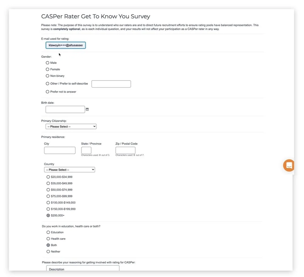
By removing the survey from the registration process and incorporating it into the onboarding phase, we will reduce user drop-off rates and streamline the user journey. This change addresses the primary issues identified in the previous journey, including the significant time consumption and user feedback from usability testing. We believe this will achieve our goals of improved user retention and satisfaction.
🪖 Reduces Friction
🧗🏽♂️ Reduces Dropoffs
👀 Will display content in a more digestible way
😊 Modernize the design
⚖️ Create more of balance between data collection and ease of entry
🗣️Adds feedback to let them know where they are in the
registration process
👮🏿 Increases security
Lo-fidelity screens for usability testing
During usability testing, a number of significant insights emerged:
🚚 Survey Placement:
It became evident that the survey needed to be moved outside of the registration process. Usability testing revealed that the survey was a major time sink and a key point of user drop-off. By relocating the survey to the onboarding process, we aimed to create a smoother and more efficient registration experience.
👀 Terms and Conditions Presentation:
The original design dedicated a full screen to the Terms and Conditions, which proved to be unnecessary and cumbersome. Observations and feedback indicated that users rarely read the Terms and Conditions in detail. Therefore, we decided to integrate this information more seamlessly into the flow without a dedicated full screen, making the overall experience less clunky and more user-friendly.
These adjustments were driven by the goal of reducing friction and enhancing the user journey from the outset.
Initially, I believed that the "finish" screen, which provided an overview of the user's training, was too lengthy, with the Call to Action (CTA) positioned too far below the fold. To address this, I tested a side-by-side design to improve readability and navigation.
Findings from Testing:
📕 Readability and Navigation:
The side-by-side design did not perform as expected. Users struggled to understand the proceeding steps, as they often scan pages for information and did not always notice the labels for Stage 1, Stage 2, etc.
📋 Effectiveness of List View:
The list view proved to be more effective. It provided a clearer, more readable format that allowed users to easily follow the training steps.
Based on these insights, the list view was chosen for its superior readability and user-friendliness.
“Final design” implementation
After several weeks of research and testing, we finalized the design, which is now live but only accessible to individuals selected for Altus's rater pool. The major updates in the final design include:
😊 Modernized Design:
A refreshed and contemporary look to enhance user experience and engagement.
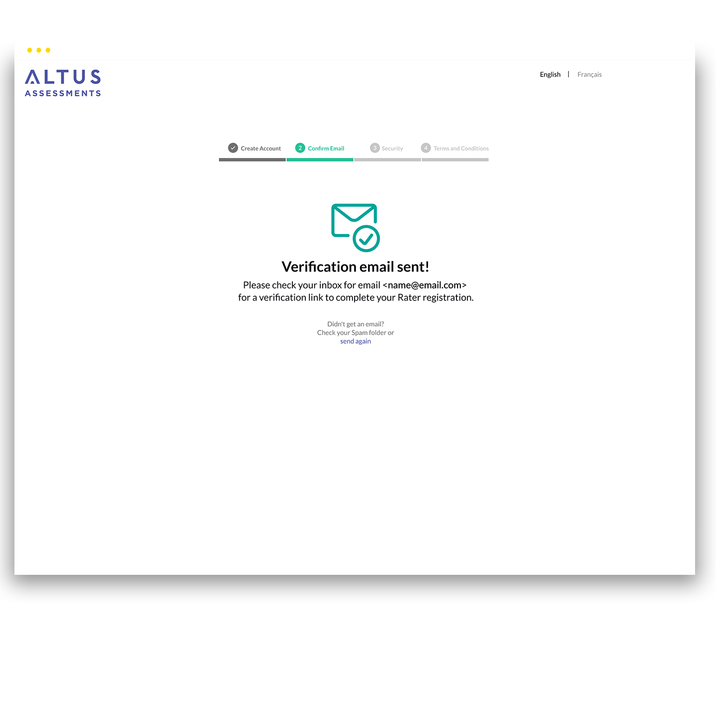
📊 Progress Bar for Feedback:
A visual progress bar was introduced to provide clear feedback on the user’s journey.
📩 Automated Email Registration:
Users now automatically receive a confirmation email upon registration, eliminating the need for them to click a CTA to request it.
👮🏿 Two-Factor Authentication:
Added for enhanced security, ensuring a more secure user experience.
📝Terms and Conditions:
These are now available within a scrollable modal for users who wish to review them in full. For those who prefer a quicker process, there is a screen where they can simply agree to the key statements.
These changes reflect our commitment to improving usability, security, and overall user satisfaction based on thorough research and user feedback.


