UX DesignBloomberg
In accounting, the process of ensuring that two sets of records are in agreement. Reconciliation is used to ensure that the money leaving an account matches the actual money spent. This is done by making sure the balances match at the end of a particular accounting period.
In 2022 the small Integrations team at Bloomberg Tax was mandated with the task of solving the Reconciliation problem that kept coming up in user interviews.
Overview
Client
Bloomberg INDG
Project date
Jan. 2022 - Aug. 2022
Total duration: 8 months
The team
Product Lead
Product Manager
Engineering team
Product Designer
My role
UX analysis (flows and persona)
Design (app and branding)
Lo-fi prototyping
Hi-fi prototyping
Developer hand-off
The Problem
There is a problem in the tax industry today. Tracking and resolving data discrepancies between the Bloomberg Tax Fixed Assets product and external ERP systems is challenging due to the complex, error-prone and manual nature of this process. Tax professionals can spend days or weeks on data reconciliation (the process of making sure different data point totals between systems balance). Customers can expect some of the following high-level benefits if this problem is addressed:
⏰ Save time
🚫 Eliminate human error
🤝 Increase traceability and trust in the data
👀 Get an improved view of how data point totals information is displayed
🧘🏽♀️ Focus on strategic work rather than the reconciliation nuances
Currently, there are several automated data reconciliation tools available on the market, however, none of them integrate with our Fixed Assets product.
Our hypothesis
We believe that we should address the need for tracking and resolving data discrepancies after assets get imported into FA by helping customers reconcile specific data point differences between FA and external data sources to solve the top customer pain point of spending significant amounts of time on the reconciliation process.
Problem Space Exploration
We decided to employ several methods while still in the problem space as a team. We felt it important to fully explore the problem before moving on to solutions. The image on the right is the estimated timeline for each method as well as those involved. Methods included but were not limited to:
🗺️ Internal journey mapping workshop to understand the reconciliation process
🎤 Internal interviews with Subject Matter Experts (SME’s)
📊 We then ran user interviews and then synthesized the results
🙋🏽♀️ Sent out a survey to help rank the pain points
UX questionaire
Before every big project, I start with a UX questionnaire. It helps me gather my thoughts and make sense of the task and problem at hand. I complete this mainly through my own knowledge, past customer interviews as well as interviews with internal stakeholders. You can see what the business goals, strategy and user goals were, among other things for the project.
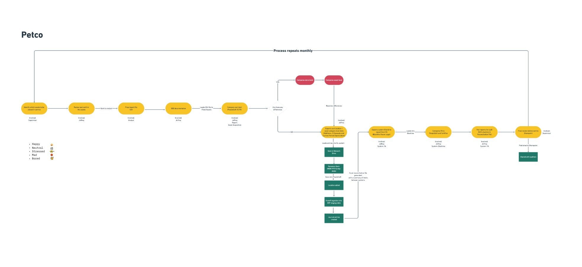
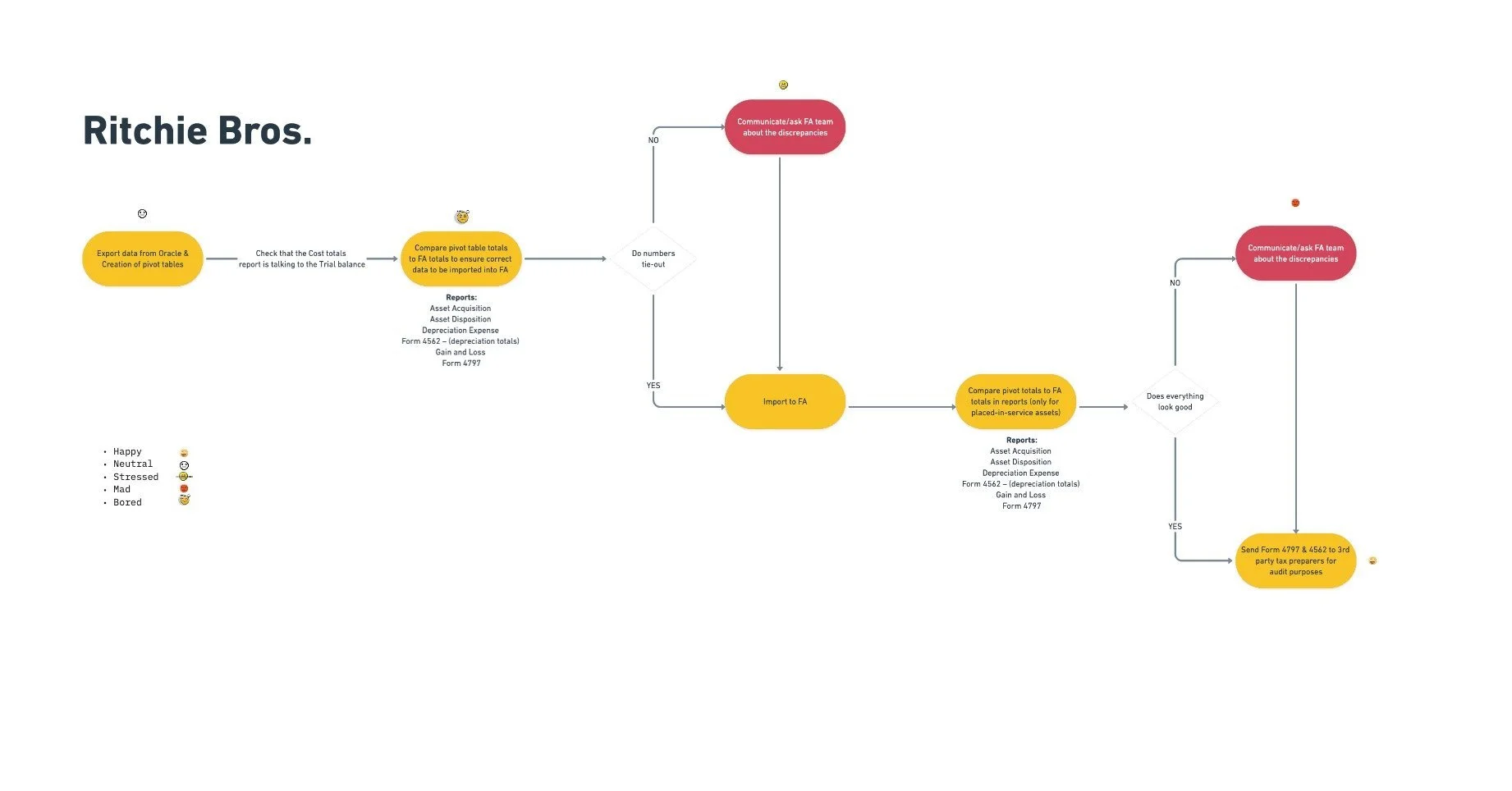
Workflows
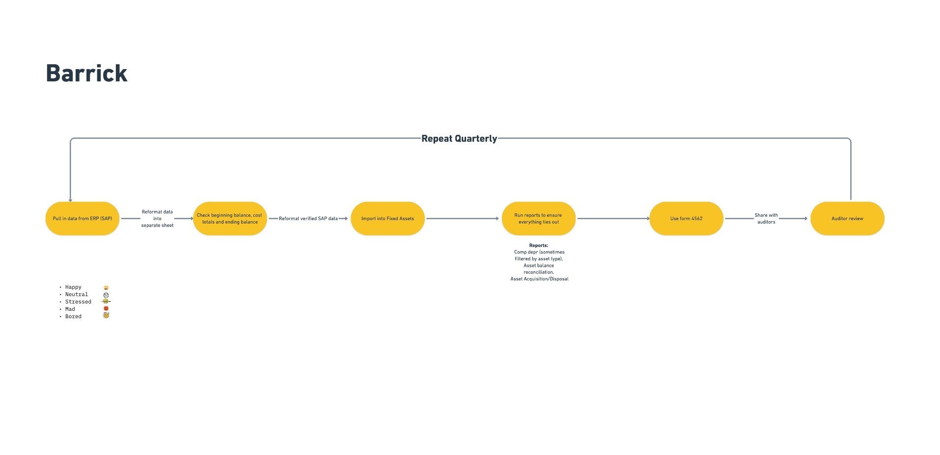
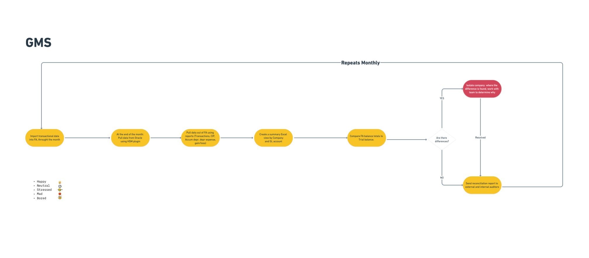
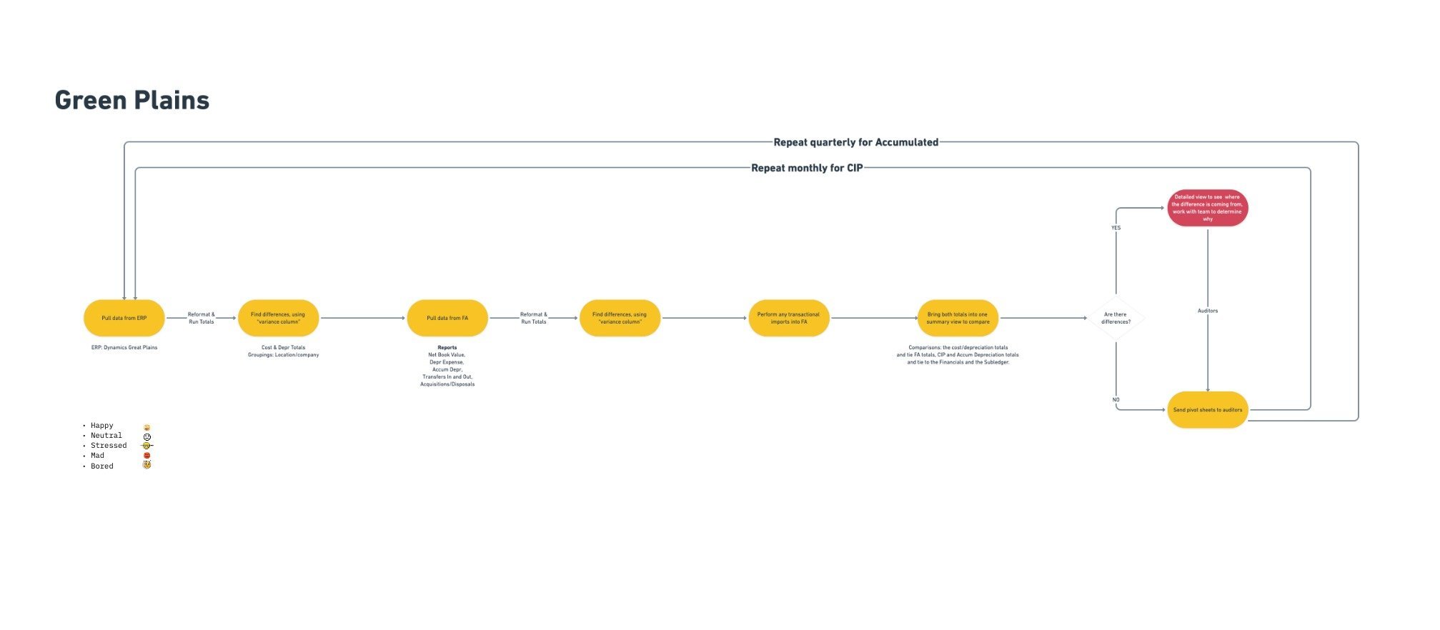
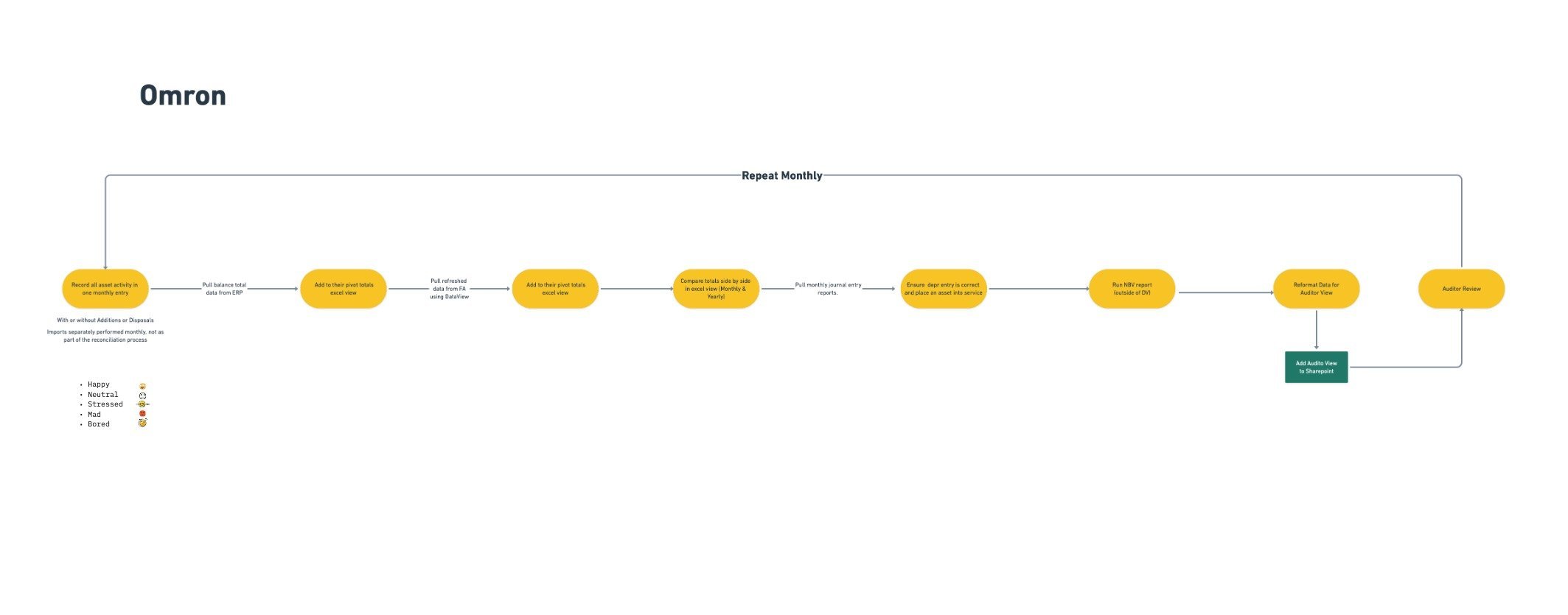
After spending time with our users we were able to determine each user’s workflow and identify the common themes and steps. This helped us create a solution that was universal.
The solution space
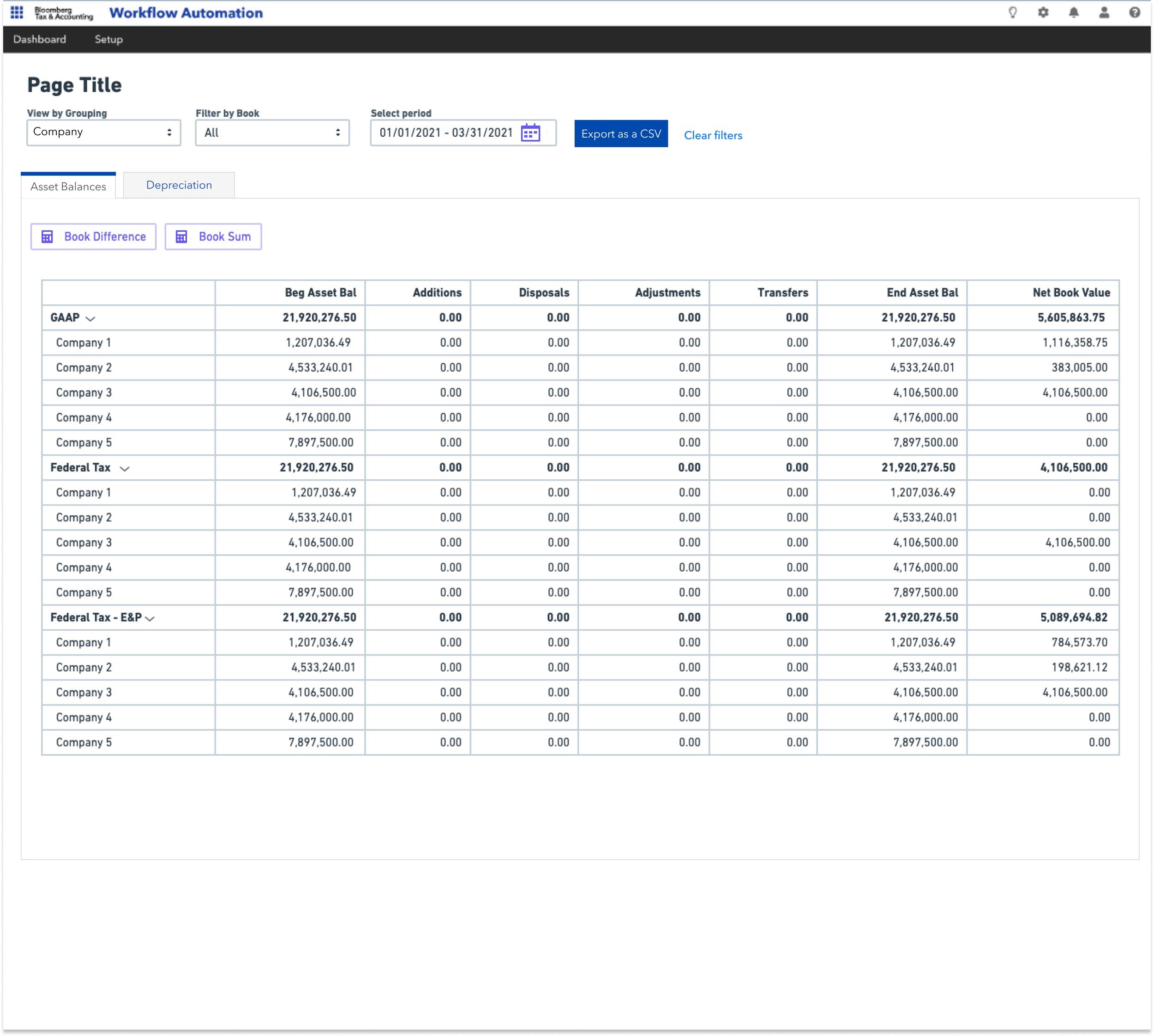
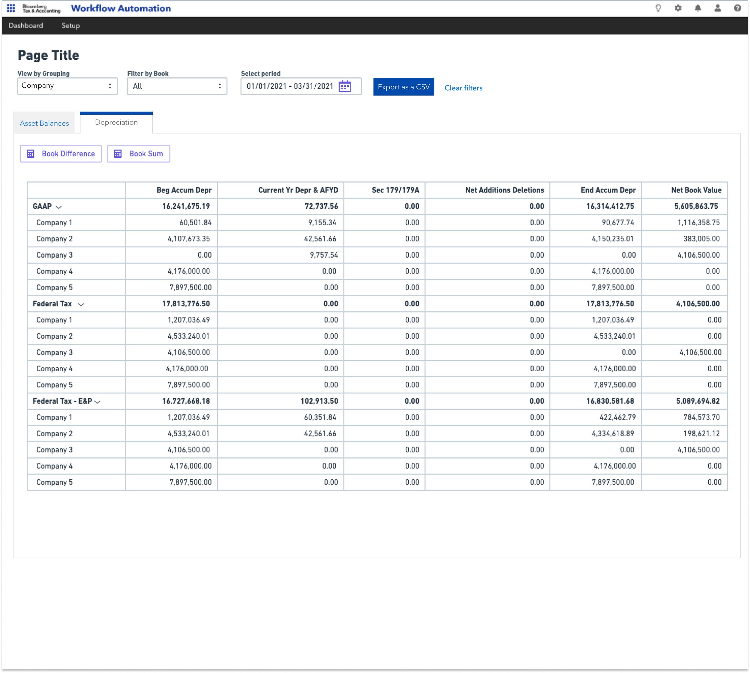
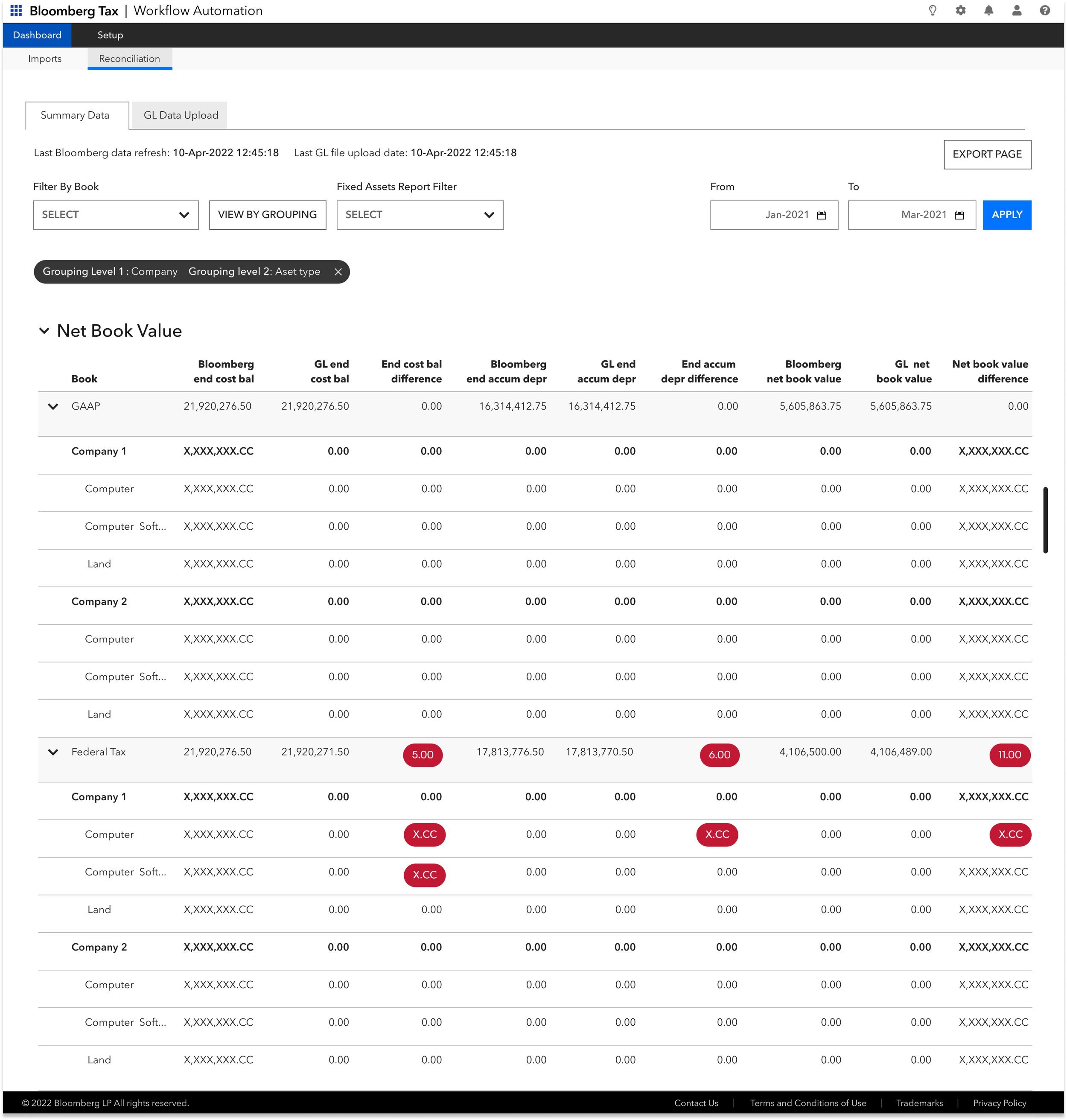
After thoroughly exploring the problem space, the team felt like we had a good idea of what was needed to make an MVP valuable. Some features included:
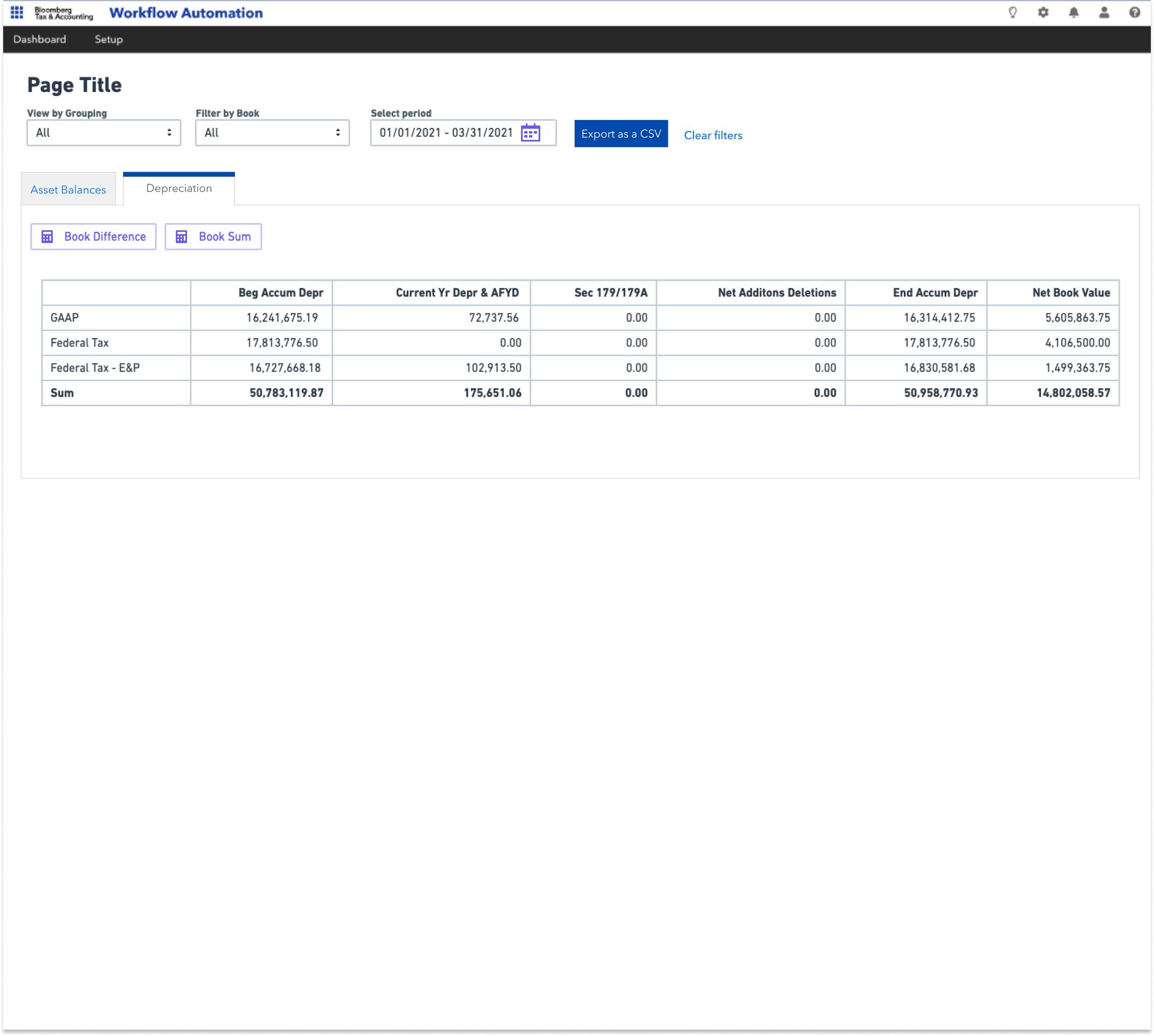
📁 The ability to filter by Book
👀 The ability to view your numbers by Grouping
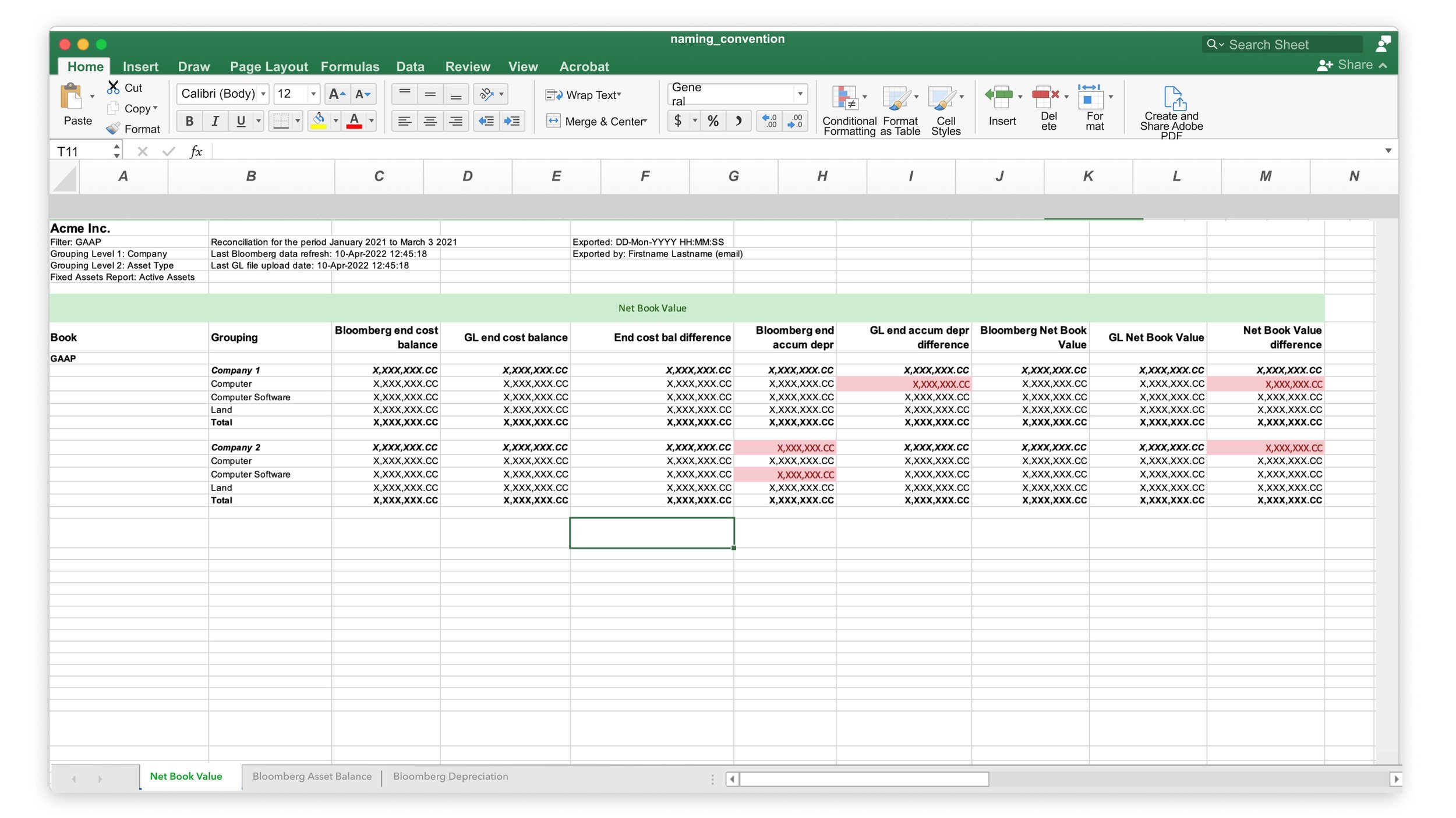
⬆️ A way to export the screens for audit purposes.
🧘🏽♂️ The need to select a focus period
🟰 The ability, to sum up and subtract your book numbers
From here I took the requirements away and designed a clickable lo-fi version of our proof of concept to present to users and get feedback on.
Key learnings from user interviews and concept tests
👀 Seeing GL Data is important
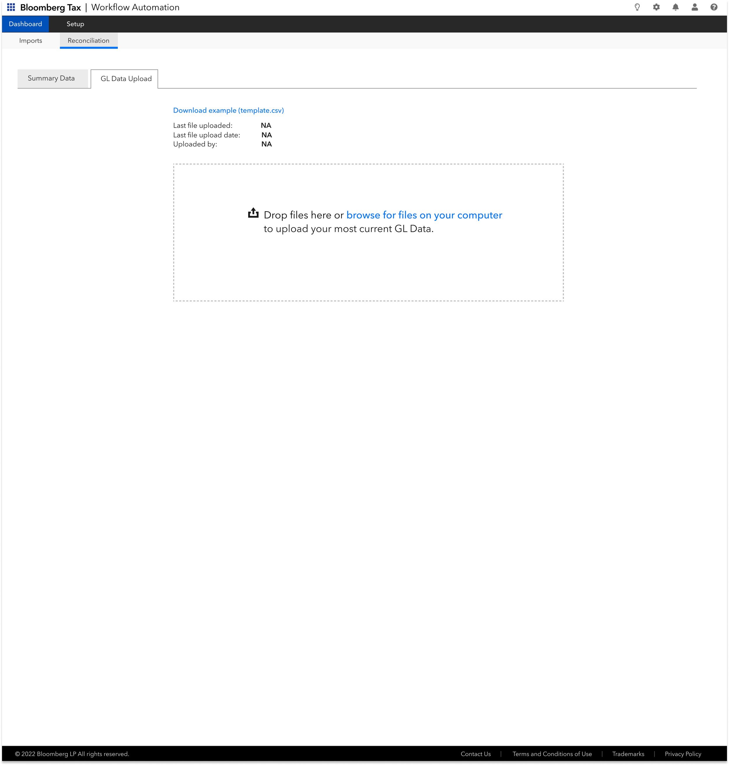
Initially, we believed that through our system we could provide all the numbers necessary to perform reconciliation. This was wrong, numbers are constantly being updated and the best way to reflect that was to allow the user a way to upload their own data to compare against our’s, which is essentially Reconciliation.
⛳️ All-in-one interface
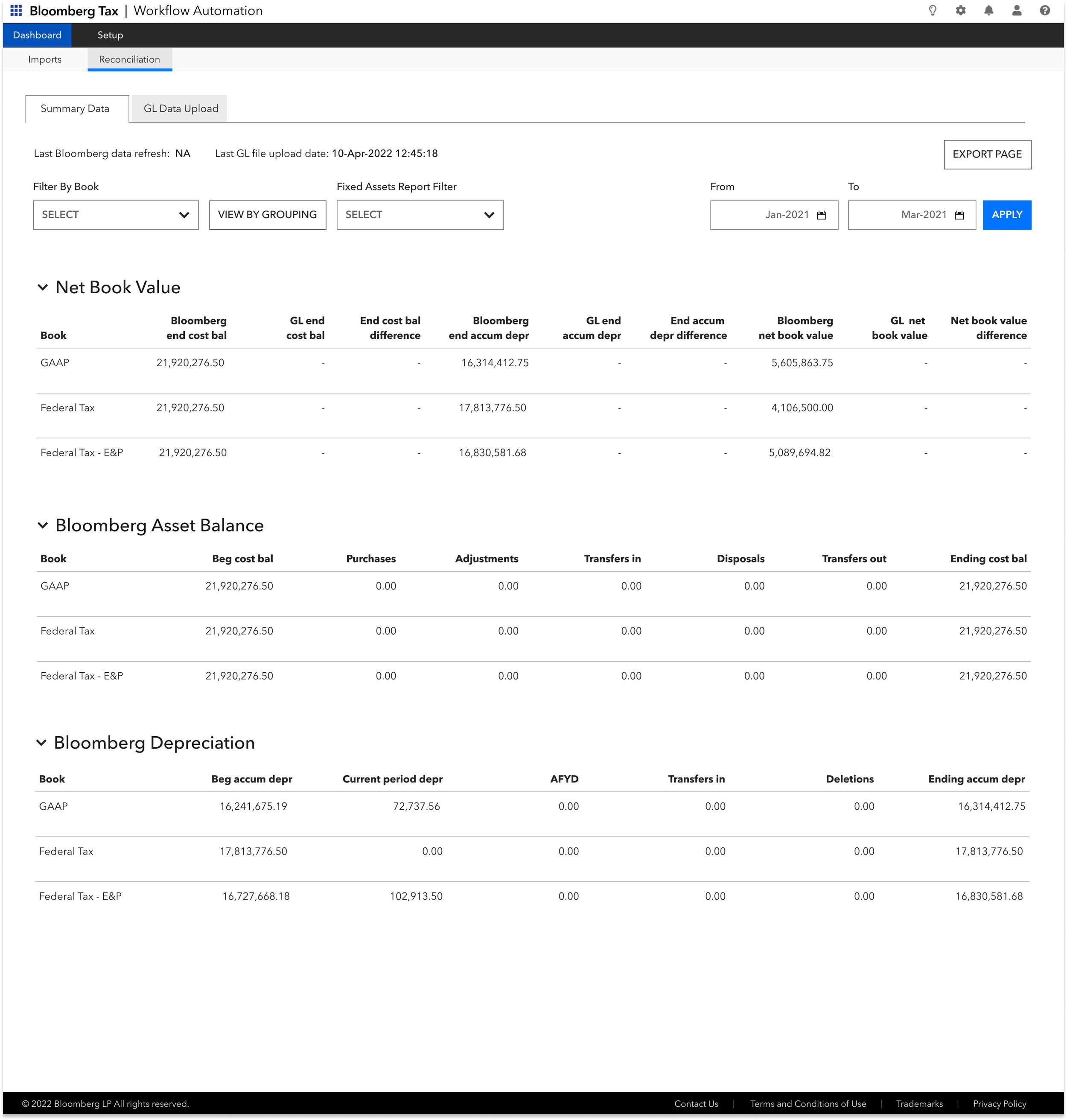
Another issue with our initial design was the fact that users needed to see all their numbers and the differences associated on the same page. We had split up the numbers in order to clean up the interface, turns out this assumption was incorrect.
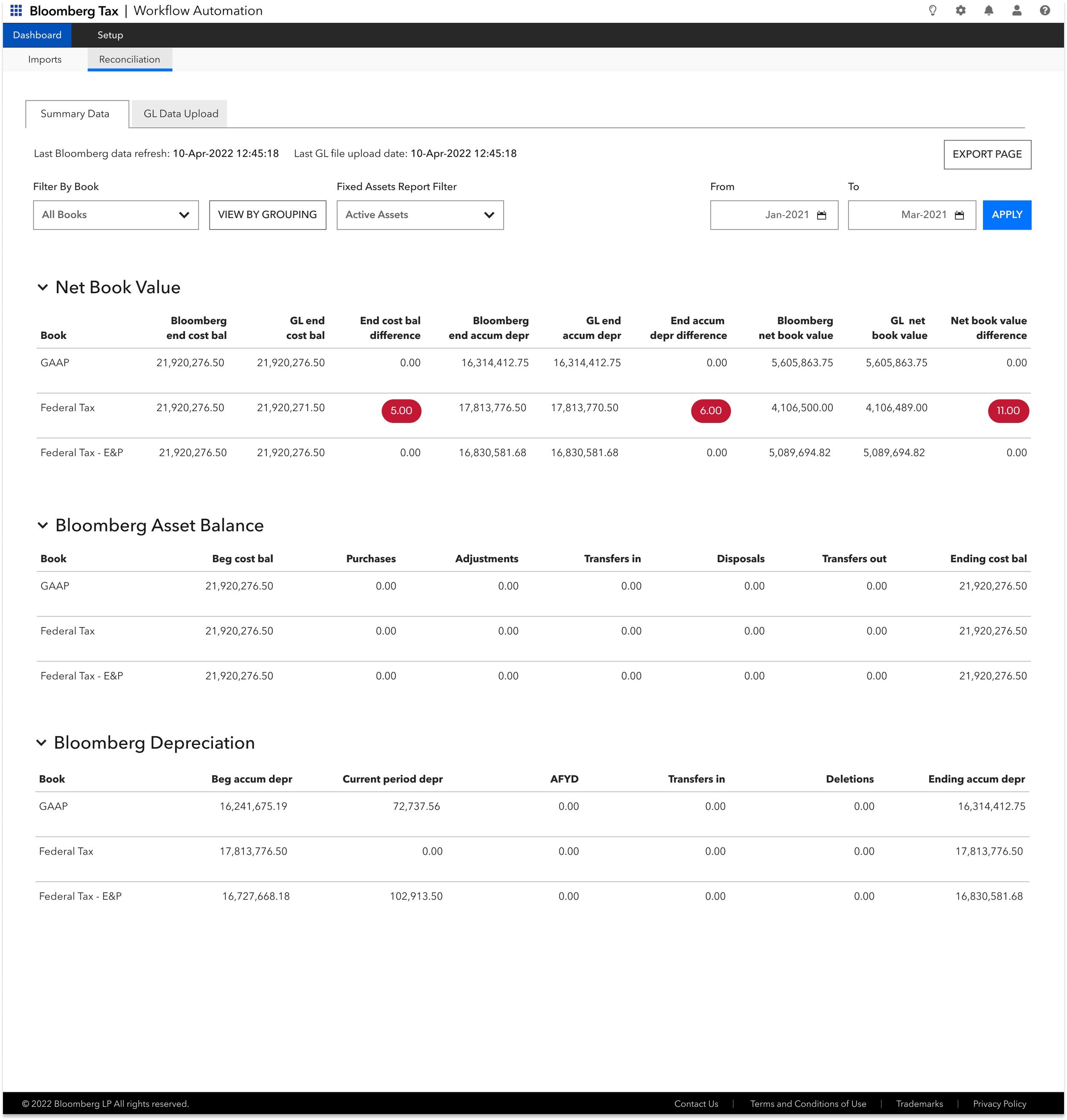
➖ A way to see the differences in the data
Our users wanted the differences in the data to be easily found. They wanted a way where their differences would be easily discoverable.
🟰 Sum and difference
It seemed that the Sum and Difference calculator didn’t prove as useful as were led to believe. This option wasn’t very important and could be descoped for the MVP.
Feedback Updates from interviews
& concept tests
From here we made modifications to the first round of designs and went into high-fidelity mocks and an actual sandbox version for our next round of interviews which were going to be usability tests. Below you can see the addressing of several user concerns, namely:
⬆️ The ability to upload their own GL data
👀 The ability to see the differences in their balances
💯 All balances and numbers live on one interface
Key learnings from usability testing
👩🏻🦲 Fixed table headers
The data presented on the screens can become very dense and the user will need to scroll, sometimes, large amounts. In this case, fixed table headers are crucial to understand what data you are indeed looking at.
📊 More formats for exports
The fact of the matter is each user will use an export in a unique way, granted some loved the excel formatted export but some really just needed the raw data and would prefer a CSV. Others wanted something uneditable like a PDF.
➖ Difference threshold
Some differences in their balances were unimportant but still registered with a red pill, distracting them. The user wanted a way to set what an important difference would be to them, clearing up the UI.
🔙 Back to top button
Again, with the amount of data presented on the interface, the ability to return to the top of the page is very important to the user.
🪗 Collapsable rows within tables
When a user chooses to view their data broken out into groups, their data becomes very dense, they wanted a way to collapse rows that aren’t currently needed.
⚒️ Copy refinement/tooltips
Some of the copy used was a tad confusing to the user, either an adjustment in the copy or the addition of tooltips explaining what the functionality actually is, perhaps both.
MVP release
With the MVP released and a number of users on board and finding value in it, we will continue to make improvements dictated by what the user tells us. Some additional enhancements needed are performance upgrades and more available data. We plan on continually engaging with the user to determine what is needed.


