
Cinema app: Product design challenge
Unhappy with the most used Cinema app in Toronto (Cineplex), I took on the challenge of trying to design a better user experience.
Competitive analysis.
The first thing I did was to try and figure out who were the competitiors in the space and what they did well and did poorly.

The user problem and desired outcomes.
The avid movie goer needs a repeatable mobile method to browse and purchase movie tickets on the go because they don’t always have a desktop computer available to them and they are afraid that movie tickets may sell out before they arrive at the theatre.
User is able to purchase a ticket from anywhere before a movie sells out.
User can make the purchase without being in front of computer, they lead busy lives and aren’t always in front of a desktop.
Their info (cc, username, pw) and location is saved and they don't have to input it every time they log on.
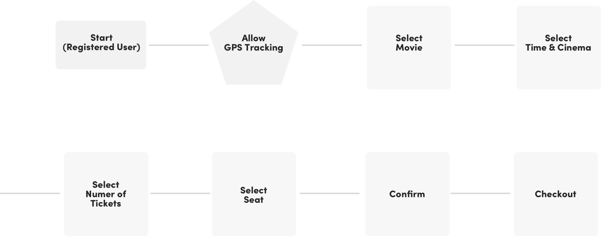
The user journey.
I determined the user journey to be as shown below.
The initial sketches.
I like to start with very rough sketches. These sketches evolved after I had a few people look at them. The idea is there and truthfully, I didn’t deviate much from the sketches.

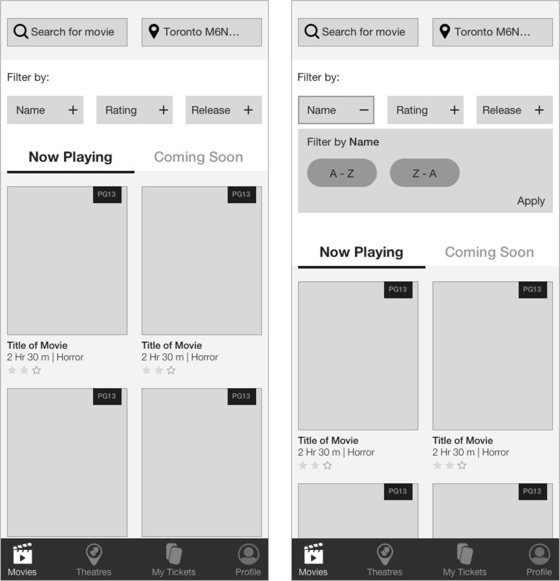
Lo-Fi Wireframes.
These are the wireframes for the “Select Movie,” page. I tried to ensure everything was legible, clear and not confusing to the user. The use of icons and interface elements convey a sense of interactivity and provide appropriate feedback. There are a lot of elements on the page so I made use of an accordion style filter (screen 2). I tried to tuck away what I could in order not to overhwelm the user.

Lo-Fi Wireframes.
These are the wireframes for the “Select Theatre,” page. Here I created a simple list, that reads left to right. The “favourite” is indicated by a heart, which I think is a clear indicator of it being so. I also made use of an accordion menu here to reveal the showtimes and date. Again, the use of icons and interface elements convey a sense of interactivity and provide appropriate feedback.
Moodboard.
I like to do wireframes in black and white. I only move onto colour when I establish a mood that I think would fit well with the theme/brand.
As you can see here, I went with a darker theme. I thought dark was appropriate, not only because The Score’s branding is darker in colour but the dark grey’s and blacks really remind me of the movie theatre experience. Lights off, the only thing that is bright is the screen. In this case it would be the CTA’s that act kind of like the screen. Bright, noticeable and bold.

Hi-Fi Wireframes.
The high fidelity wireframes, I think, demonstrate a very easy and clear process. I made the interface black. The thought was that it mimics a movie theatre experience.
All the CTA’s appear in yellow, a high contrast. The user is busy and on the go, I wanted to ensure that they could see the CTA’s clearly, wherever they are. The thought was to also give as much control and feedback as possible to the user. Back buttons, cancel options and the abiltiy to update their chosen theatre, time, current location and number of tickets are are on each relevant screen. I tried to stay away from too many shadows or gradients, I wanted the content to reamin the priority.
I settled on Helvetica Neue for the typeface. It’s clear, legible and has many weights to it.
I created an additional screen, a select ticket page. I thought putting this on its own page worked best, as it can entail a lot of information and I believe it kept the interface light and more digestable.
