LA Fitness: UX Case Study
In 2020 the LA Fitness website was shockingly dated in look and functionality. I took on the challenge of the re-design and re-thinking of the LA Fitness website.
No excuses.
LA Fitness is the No. 1 health club in the U.S., according to industry publication Club Industry. The chain, headquartered in Irvine, California, has more than 700 locations nationwide and brought in an estimated $2 billion in revenue in 2017. The state of the website does not properly convey the fact that they are indeed the largest.
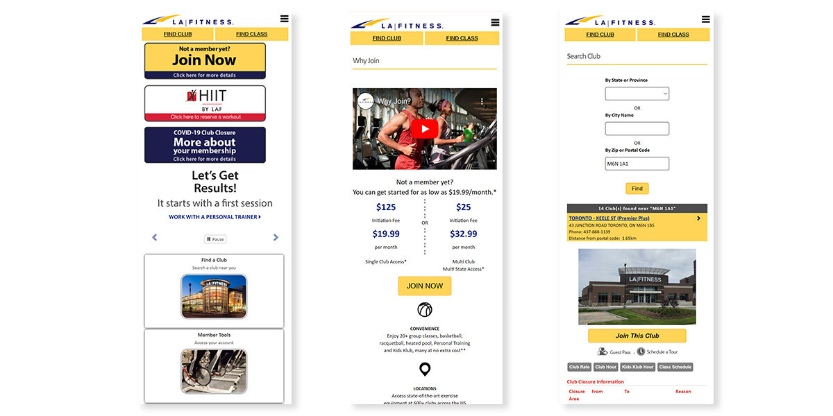
The current site.
It’s easy to see, the LA Fitness website in its current state is not very appealing. Confusing. Dated. Lacks a true connection to what its gyms look like. Initially, I didn’t have a clear mission or problem statement, all I knew was that the site needed help in several ways.
Research methods.
The first research method came in the form of a competitive analysis. The competitive analysis performed looked at 5 similar gyms that were attractive to the same type of user. This gave my research quantitative data.
The second method was one on one interviews, performed with a number of users. Through these interviews I was able to attain a mix of qualitative and quantitative data.
Additionally I performed a site audit to address any usability and accessibility issues that lafitness.com currently has.
A usability test was conducted later in the process with Lo-fi and High-fi prototypes. For the sake of brevity, the full research report will not be addressed below. The full report can be seen here.
User interviews.
Interviews were my first breakthrough, they revealed how they thought the current site, was messy and overly complicated. Many participants revealed that the site “felt untrustworthy.” Some of the participants also wished there were a chat feature and a free trial offer which has become the norm within the industry. Some notable quotes have been captured below.
“If this is how complicated it is to give you my money, how bad is signing up for a class or having a complaint solved going to be?”
— Participant 2
“Too many options are provided to sift through.”
— Participant 1
“Though I did naturally look for this button in the upper right of the website before seeing the big yellow graphic on the upper left. ”
— Participant 3
Usability & accessibility audit.
The Usability & Accessibility Audit revealed many issues with the LA Fitness site. The lack of accessible and usable site ultimately leads to potential or current clients dropping off the site before committing to a new membership. It affects the bottom line.
No hover states.
Lack of a hover state doesn't indicate to the user that the button is clickable. It fails to keep the user informed through the appropriate feedback.

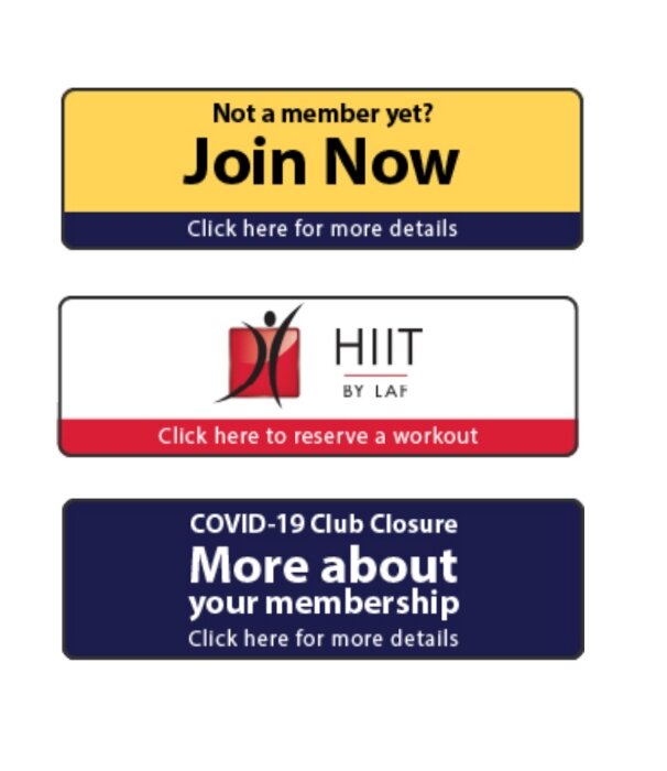
Irrelevant information &
lack of consistency.
The LA Fitness homepage contains information which is irrelevant or rarely needed for the user. The use of several types of fonts, colours and the number of images creates unneeded noise that ultimately diminishes the visibility and effectiveness of the "Join Now," button. There is also an overall lack of consistency between their CTA’s. I count at least 4 different ways a CTA is treated on the LA Fitness homepage, alone. This ultimately creates confusion as to what certain things do on the site, this coupled with a lack of feedback is concerning.
Research insights & problem statement.
The inconsistent experience between the website and physical gym: A gym's website is, more and more frequently, the first impression given to a potential member. This first impression can influence a person's decision if they wish to continue with a possible membership. Important first impressions include but are not limited to, ease of use, easily found answers to questions, pattern expectations and overall aesthetic.
Information not easily found: Users appreciate the gym's being upfront and clear with their fees and membership options. Given the amount of competition in the market, a site or gym that can communicate this effectively is oftentimes deemed reliable and trustworthy. Users also desire an easy and efficient way to get information, be that through a clear and concise FAQ page or in the form of a live chat.
Online free trial sign up: Potential members appreciate a free trial that they can sign up for online. There is a greater chance a user will sign up for a long term membership if they can try out a gym's classes and facilities before committing to a membership.
These insights led me to my eureka moment, the problem statement is as follows:
Our young working professional struggles to find a proper gym that meets their fitness and budgetary goals because they are hesitant to commit to any gym long term sight unseen. Our solution should deliver a quick and easy way to sign up for a free trial and test out a gym.
Usability testing.
Overall I tested 7 people, 3 tested my first iteration, 4 tested my second, more refined mockup. They were given the task of acting as if they were looking for a new gym and had done the necessary online research and decided they wanted to try out LA Fitness. They were asked to complete the free-trial online sign-up, all the way to completion.
Key findings & recommendation.
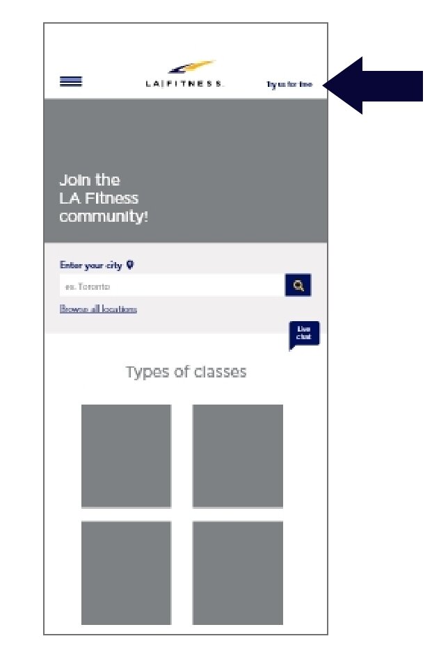
The first key finding was the fact that during my first 3 tests, all felt the “try a free class” button was far too small and not noticeable enough.
The recommendation is to make this button more noticeable.

Key findings & recommendation.
The second key finding was the overall lack of control, no options to edit, change or go back in my first iteration. The user-described feeling stuck. Many do not like hitting the back button in the browser. All wanted a confirmation screen to know that there was indeed a pass being sent to them. The recommendation is to add features like edit, change and go back and some sort of confirmation. The empty spaces where the arrows point show areas where these features can be added.

Key findings & recommendation.
The third key finding was the lack of an explanation as to what the free-pass includes and how long it is good for.
The recommendation is to add an explanation before the user is asked for their information and reminded when they do complete their profile.
Additional key findings.
Some thought “browse all locations,” was unnecessary.
Additionally, 4 out of the 7 tested were confused as to why adding their location appeared on the first and second screens.
2 out of the 4 who saw iteration 2 felt the graphic indicating where you are in the process could be used as a breadcrumb.
2 out of the 4 who saw iteration 2 also felt the “our classes” section on page 2 was unnecessary and could lead someone to not completing the task and instead would browse.
1 out of the 4 respondents felt the “return to main screen” on the final screen was pointless and would rather see some sort of incentive to browse the classes.
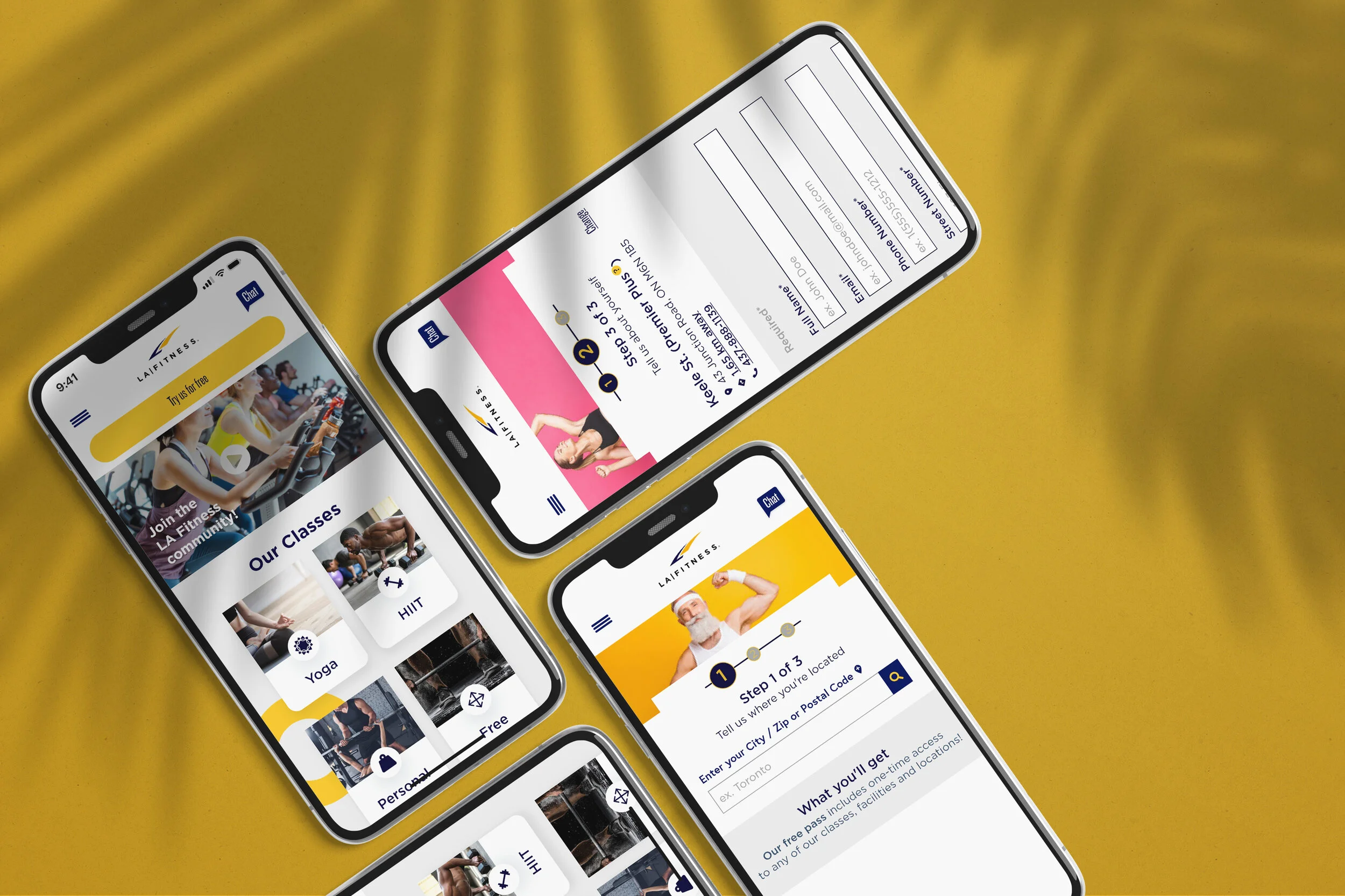
Iteration 1.
No control was given to the users. No way of going back, editing or changing inputted information. I also lacked a confirmation screen, which is vital in giving the user feedback.

Iteration 2.
The next design evolved to this version. Usability testing drove me to adjust this iteration. I gave the user control, adding multiple options where they could edit, change or go back to the previous page. I also added a much needed confirmation page!
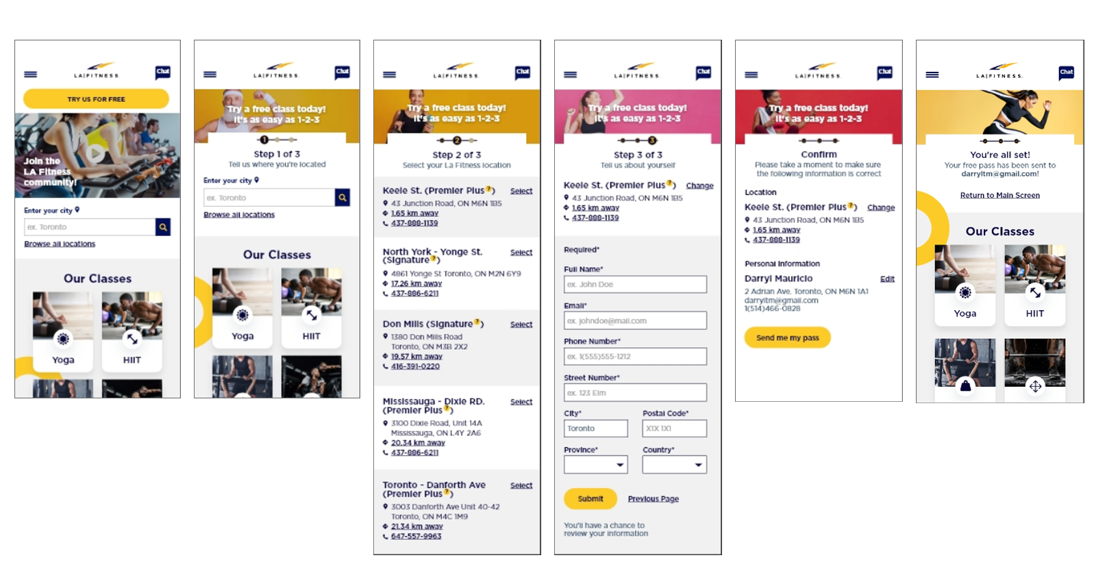
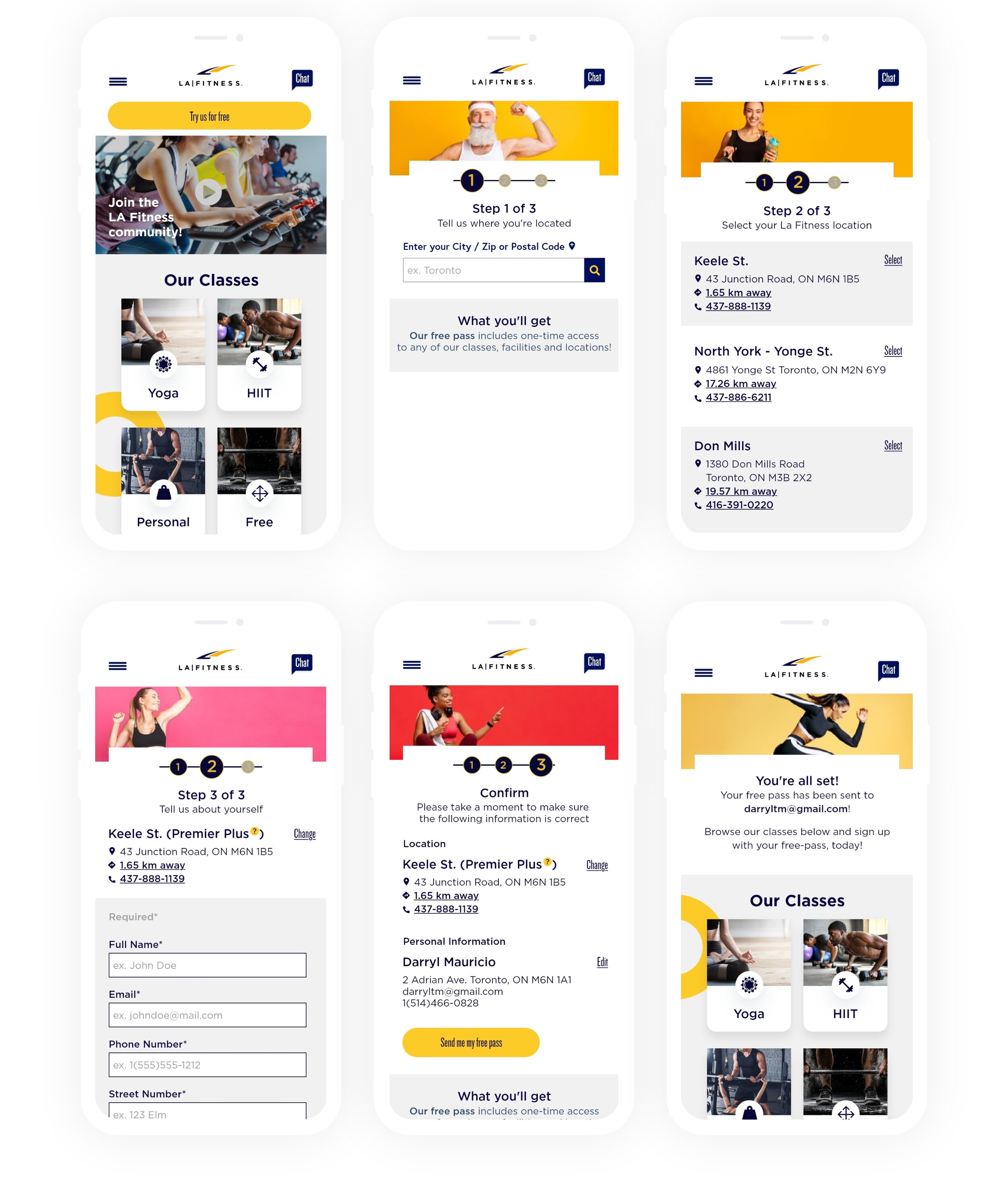
Iteration 3.
This is where I landed after all the rounds of usability testing. Usability testing drove me to adjust this as well. Browse all locations was not necessary as well as asking for the location on 2 screens. The text in the image was unnecessary as well. On screen 2, having the classes proved to be distracting. All participants also wished the graphic to show where you are in the stage of the sign up acted as a breadcrumb. A live prototype can be found here.
The design system.
The design system colour palette was based on the LA Fitness logo. The yellow and blue and I chose colours that were complimentary.
The fonts were chosen based on clarity and how they worked with each other. The main font, Gotham is a mono-space font and in my opinion works well with Knockout, a condensed font.
All font sizes ensure accessibility throughout all screens.
Icons were filled in at all times, with softer edges. The more liberal use of icons could reduce the copy on each screen as well as add a playfulness.
