UX DesignGetty Images
In late 2023, Getty Images aimed to expand its AI capabilities by enabling users to modify stock images directly on the platform. Building on their existing technology for generating original images using AI, this new feature would allow users to customize images to meet their specific needs. This enhancement would streamline the process, allowing users to search for an image, modify it, and download the final version within minutes, all within the Getty Images platform.
Overview
Client
Getty Images + iStock
Project date
Dec. 2023 - April. 2024
Total duration: 5 months
The team
Product Manager
UX Researcher(s)
Engineering team
Content Designer
Design Manager
Product Designer
My role
UX analysis (flows and persona)
Design (app and branding)
Lo-fi prototyping
Hi-fi prototyping
Developer hand-off
The Problem
Customers often find it time-consuming and challenging to locate or generate an image that perfectly meets their needs, leading to frustration and suboptimal outcomes. This difficulty results in users either abandoning their search, settling for less-than-perfect content, or spending additional resources to manually edit the image to their specifications. Users wish for a more efficient and straightforward process to find and modify stock images, eliminating the need to pay for external help to perfect the images.
Our hypothesis
By aligning the generation and modification feature sets and customer experiences, allowing customers to use common text prompts, img2img, inpainting, outpainting, and other controls across both generated and pre-shot content, we will reduce complexity and enhance user satisfaction. Simplifying the feature set, UI, and partner integrations will make the process more intuitive and efficient for users, leading to increased usage and satisfaction.
Problem Space Exploration
In order to understand how to best solve the user’s problem while also leveraging the technology available to us, we employed several methods, including:
🗺️ User scenario mapping
🕵🏼 Identifying top-level customer journeys and their pain points
🎤 User interviews, conducted by our research team
Scenario development
Our team, consisting of myself, the content designer, and the design manager, set out to create a set of user scenarios based on user interviews and our deep understanding of the users. These scenarios were then used to develop comprehensive customer journeys, guiding our design process and ensuring we addressed key user needs and pain points.
Customer journeys
Next we developed top-level customer journey’s. These journey’s were based off the modifications that would be available to them at the time of launch:
🔁 Replace
Replacing an object in the image by entering a prompt and generating a new object
🗑️ Remove
Removing an unwanted object from an image by selecting it
↕️ Extend
Extending the image by describing what you’d like the rest of the scene to look like
Common pain points
Through our user scenario and customer journey exercise as well as user interviews, we were able to identify several common pain points.
In the Modify space
🧭 Navigational Confusion:
Clicking on the modify button opens a new tab with a completely different UI, making it overwhelming and unclear where to focus.
🔧 Tool Familiarity:
Users are unsure about the purpose and functionality of the tools available, leading to confusion about which tool is best suited for their needs.
💰 Cost Clarity:
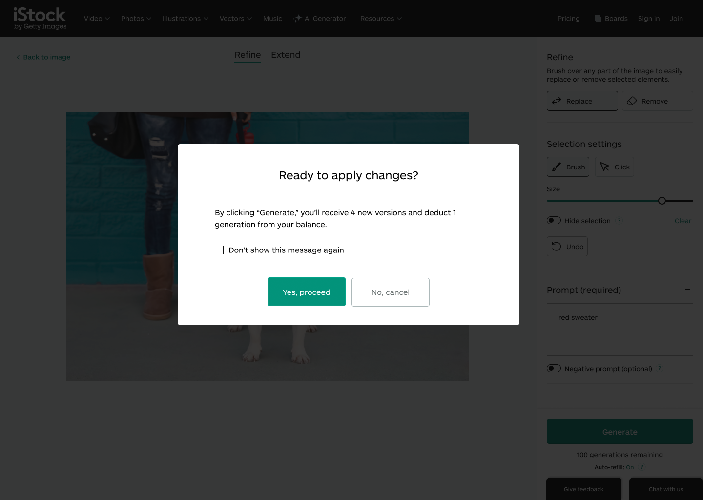
Uncertainty about the cost structure for modifications, including whether they are charged during tool usage or only upon download/license, creates anxiety.
😋 Modification Satisfaction:
Users are dissatisfied with being charged for modifications they do not like or find useful.
On the asset detail page (ADP) and in the Modify space
👏🏽 Sharing Difficulties:
Users want to share images directly from the Asset Detail Page (ADP) and the Modify space before downloading but find no easy way to do so.
🏦 Saving and Returning:
Users want to save their progress on an image and return to it later but are unsure if this functionality exists or how to access it.
Design iterations
At Getty Images, once the problem space has been thoroughly explored, we proceed to ideate potential solutions. These solutions are then presented to our technical partners and relevant stakeholders, allowing us to refine the concepts based on their feedback and technical constraints. For this particular project, due to its size and importance, we went through four iterations—more than usual—to ensure we delivered the best possible user experience from the outset.
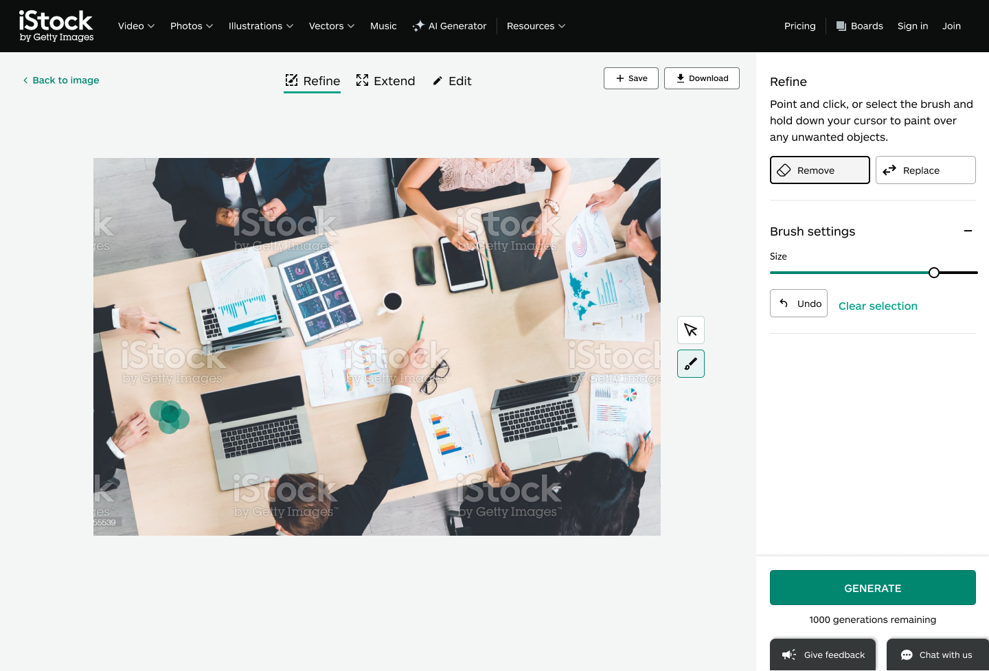
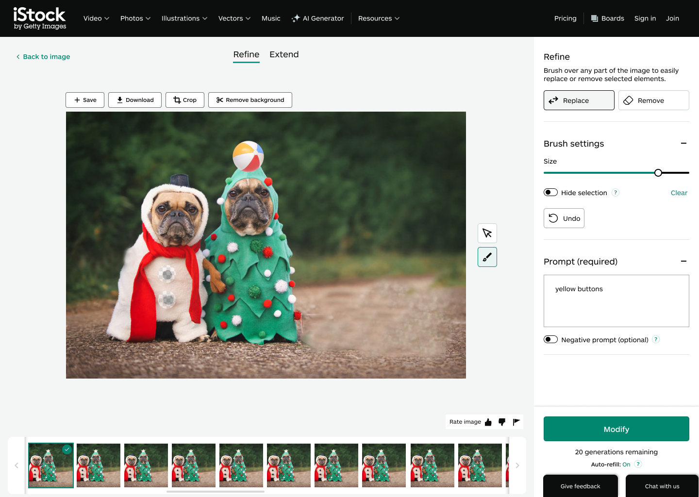
Below are a few selections from the four iterations we conducted. My focus was on the designs within the Modify Space—the dedicated interface on the site where users can make AI-driven modifications to images. These iterations reflect our efforts to refine and enhance the user experience in this specific area.
Iterative Design and Feedback
Throughout the design process, we collaborated closely with our tech partners and kept relevant stakeholders informed of our progress. After the first iteration, we conducted a quick concept test with users, gathering valuable feedback that informed the production-ready version:
🤚🏼 Crop and Remove Background Features:
Feedback from our tech partners indicated that these features needed to be outside the Modify Space. Leadership decided to expedite our timeline, deeming these features out of scope for phase 1.
👆🏼Point & Click Tool:
NVIDIA, our AI partner, advised that the point and click tool with AI-generated masks was also out of scope for this phase.
⬇️ Download Button Placement:
Research and Design leadership recommended relocating the download button to a more discoverable position. Initially located in the top right corner, users had difficulty finding it. The new placement, appearing after the user clicks "Generate," improved visibility.
😷 Mask Compatibility:
Through extensive testing, we ensured the mask worked effectively on various types of images, enhancing usability across different scenarios.
This feedback-driven approach allowed us to refine the design and deliver a more user-centric product.
Final Implementation and Future Plans
After weeks of extensive research and multiple design reviews with our tech partners and stakeholders, we finalized the implementation.
Our plan is to continuously monitor user feedback and conduct additional user interviews in the coming weeks to identify further improvements and enhancements for the feature.


