Casper for Raters Registration
In 2020, Altus Assessments was looking to revamp and rejuvenate its rating application, recognizing the pressing need to breathe new life into it. The existing application, though functional, had grown somewhat dated and was burdened with a myriad of issues. These challenges, rooted in the app's outdated design and functionality, served as a compelling catalyst for Altus Assessments to undertake the overhaul.
The team:
Product Manager, Engineering team, Product Designer
My Role:
Product Design
UX Case Study:
Research Methods
We decided to employ several methods while still in the problem space as a team. Methods included but were not limited to:
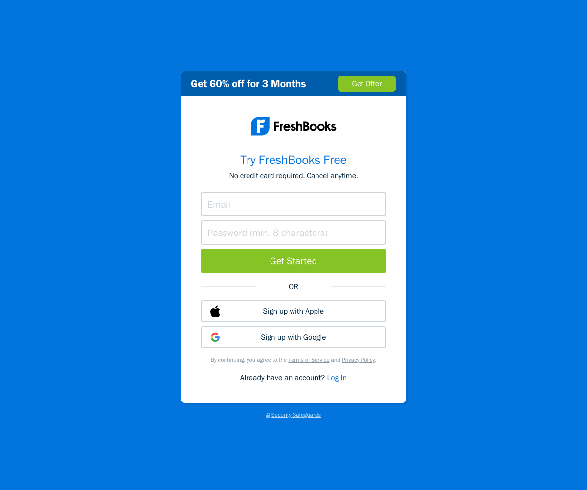
🧐 I conducted a competitive & comparative analysis where I researched what I considered to be great registration processes, examining platforms such as Google, Amazon, Facebook, Twitter, and FreshBooks.
🎤 User Interviews - we interviewed 10 participants.
The current site and journey
In its current state, it’s pretty evident that this app has been an afterthought for Altus Assessments. Speaking to internal stakeholders, Raters make up the biggest cost for the company yet have been ignored as a user group.


Competitive & comparative analysis
Below are some of the registration flows I looked at. They all share a few common threads, including; making it as easy as possible for the user meaning they do most of the work for the user, having limited to no navigation and finally they are fast.


The problem
The Current User Journey has a high friction rate between gathering data and ease of entry, it takes a lot of time and steps to register which has led to a high number of drop-offs.
The screens additionally are very heavy in content and it can be very hard to digest, especially with the way it’s presented to the user.
The current design is very dated and inconsistent.
The sign-in also lacks proper security, Altus is dealing with very sensitive information.
Finally, there is a lack of feedback to let the user know where exactly they are in the process.
The users
Raters are 65% female and 35%, male.
32% American.
29% Australian and Canadian.
10% are in Eastern Europe.
Windows - 40%.
Macintosh - 25%
Notable user interview quotes
“Everything just looks so dated, I wasn’t sure I was on the right site at first.”
— Participant 3
“The steps to register took forever, had I not needed the paycheck, I question if I would have finished.”
— Participant 8
Solution goals
Reduce drop-off/Increase ease of entry.
Update design to help ensure confidence and credibility in the product.
Create more balance between data collection and ease of entry.
Provide feedback to users in order to let them know where they are in the process.
Increase security
The new user journey
I believe the new user journey solves all of the problems of the previous journey and accomplishes all of our goals. One of the bigger changes I made was to remove the survey from the registration process. It ate up loads of time and was the point where most of the users dropped off (this feedback also came up in usability testing). The survey was moved to a part of the “onboarding” process.
Reduces Friction
Reduces Dropoffs
Will display content in a more digestible way
Modernize the design
Create more of balance between data collection and ease of entry
Adds feedback to let them know where they are in the
registration processIncreases security

Usability testing
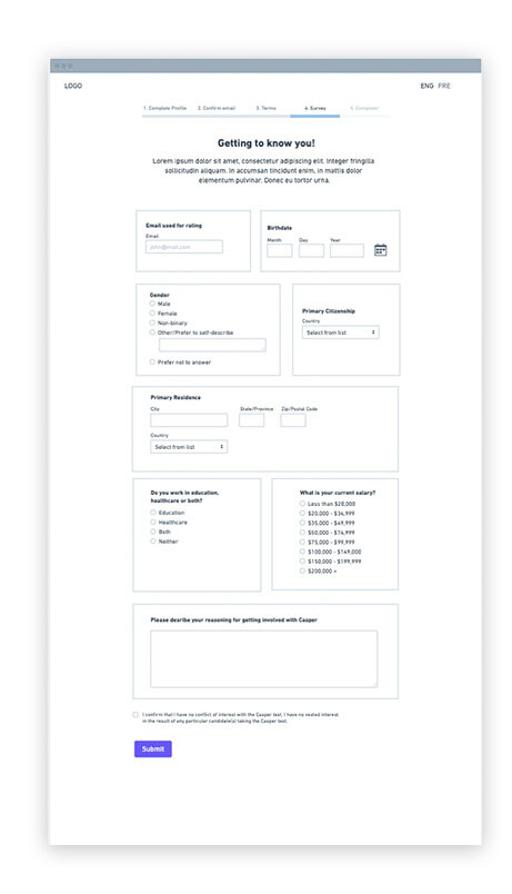
Below are my initial wireframes. Probably the biggest thing that came out of it was the need to move the survey outside of the registration process and to no longer dedicate a full screen to the terms and conditions.
Truthfully, and I am guilty of this, users rarely read the Terms and Conditions and dedicating a full screen to this was clunky and not needed.

Key findings & recommendations
The Terms and Conditions did not need a full dedicated screen. Doing this pushed the CTA far too down and frankly, reading this screen was daunting.
The survey made no sense as a part of the registration process! Altus suffered so many drop-offs at this portion of the process. We decided to move it outside of registration and is now part of the training. Another decision we made was to not hard code it, instead it will live in Survey Monkey, this way the operations and research teams are able to update as easily and frequently as they wish.
Key findings & recommendations
Key findings & recommendations

Initially, I thought the “finish” screen where the user gets an overview of their training was far too long in length. The CTA was far too below the fold. After testing this side-by-side design, I realized the list view did work better. Users found it hard to know what the proceeding step was. Users scan for info on a page and didn’t always see the labels of Stage 1, Stage 2… The list view was just more readable.
A modernized design
A progress bar for feedback
The user is now automatically sent an email when they register an email with us. Previously the user had to click on a CTA asking for confirmation emails
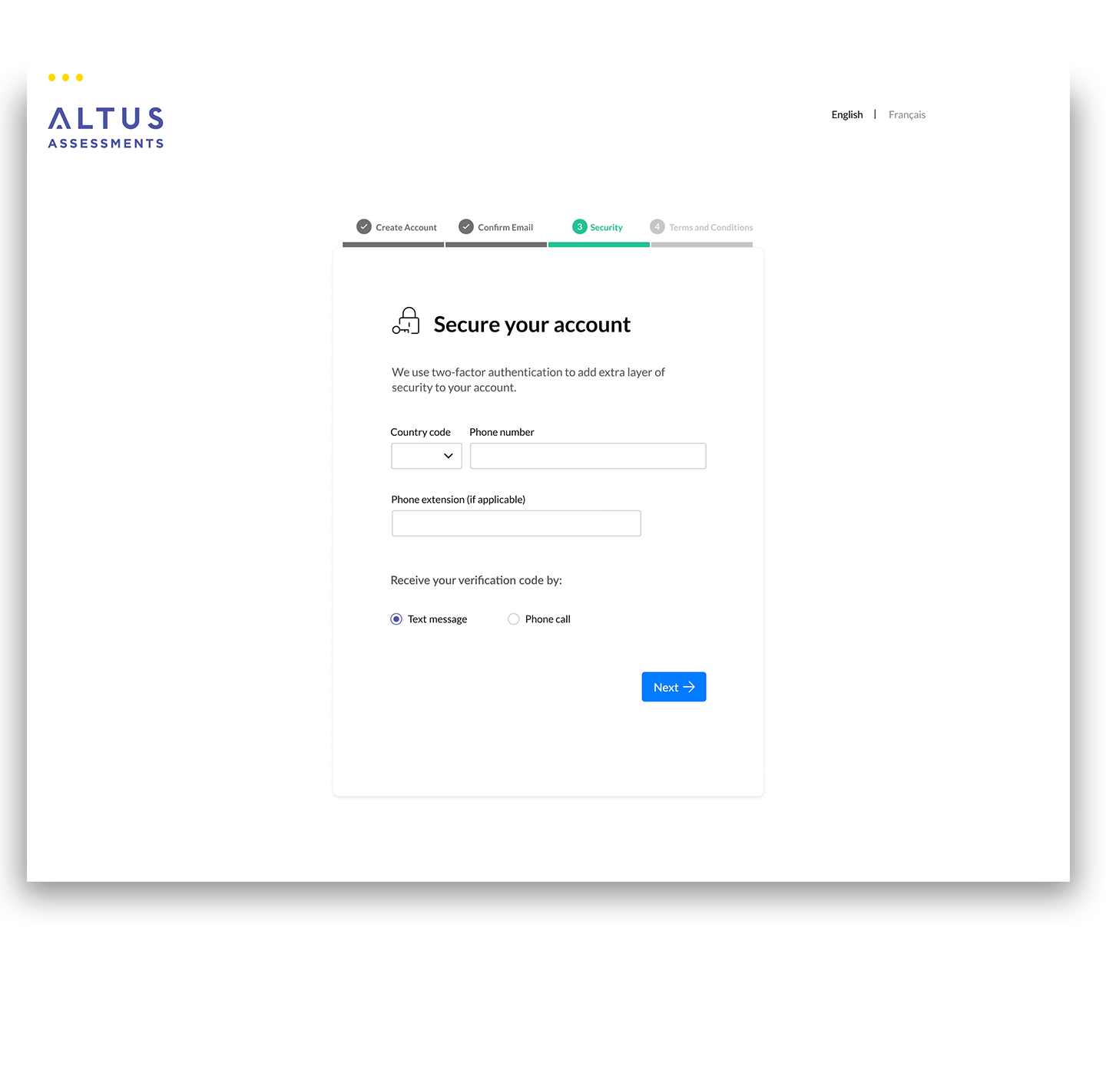
After weeks of research and testing, this is where the final design landed. The design is currently live but only accessible to those who Altus decides to hire as a part of their rater pool. The major changes you can see below are:
The final design
Added a 2 factor authentication for added security
The Terms and Conditions now lives withing a scrollable modal if the user so wishes to review them in full. If not there is now a screen where they can simply agree to the key statements